Ezekiel Jason — Portfolio | Built in Framer


Category:
Personal Branding / Portfolio
Client:
Ezekiel Jason
Duration:
3 Days
Challenge
Most product visual designers lose clients before the first conversation because:
Their portfolio looks like everyone else's — no distinct identity
The work is buried in a generic layout that doesn't reflect the quality of the visuals
There's no clear path from "impressed visitor" to "paying client"
The challenge was to design a portfolio that:
Stops the scroll with a visual identity as strong as the work itself
Communicates niche expertise — AI product visuals and brand identity — instantly
Converts brand owners into inquiries without a single word of hard selling
Strategy & Approach
Lead With Identity, Not Just Work:
The hero section was designed to:
Put the designer front and center — personality sells in creative services
Use the "PORTFOLIO" typographic treatment to create immediate visual impact
Let the silver, chrome aesthetic signal premium positioning from the first frame
A Site That Feels Like the Work:
The design language was chosen deliberately:
Chrome and liquid metal textures mirror high-end product photography aesthetics
Dark backgrounds make visuals pop — the same principle used in product shoots
The site itself becomes a proof of concept for what Ezekiel can do for a brand
Page Flow Built Around How Brand Owners Think:
The entire site follows the buyer's natural journey:
"Who is this?" — Hero: face, name, niche
"What have they done?" — Work: bold, visual-first portfolio
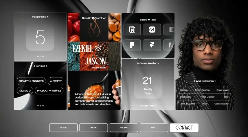
"Are they legit?" — About: bento grid with tools, experience, location
"What will it cost?" — Pricing: clean, no-friction tiers
"Let's talk." — Contact: personal, direct, human
Every section earns the next click.
Pricing Designed to Remove Hesitation:
Instead of hiding numbers or using vague "contact for pricing":
Three clear tiers anchor the conversation at $300, $400, and $500
One-time pricing removes commitment anxiety for first-time buyers
Each tier is named for growth stage — Single, Growth, Scale — so clients self-select
Visual Trust Over Written Claims:
Instead of testimonials or long bios:
The work page lets the product visuals speak entirely on their own
Bold orange backgrounds on the work section create energy and confidence
The bento about page shows tools and experience at a glance — no reading required
Key Features
Chrome and liquid metal UI that mirrors the product visual aesthetic
Full-bleed editorial typography for high-fashion brand positioning
Bento grid about section for scannable credibility building
Work section with zero distractions — visuals only
Tiered pricing with growth-stage naming for easy self-selection
Contact page with photo — human, approachable, direct
Tools Used:
Framer (Design + Development)
Editorial art direction principles
Personal branding strategy for creative freelancers
Results
The final website achieves:
Communicates niche and quality within the first 3 seconds
Makes the designer's personality and aesthetic inseparable from the brand
Guides product business owners from curiosity to contact without friction
Positions Ezekiel Jason as a premium choice — not just another option
Conclusion
Ezekiel didn’t need more portfolio slides — he needed a website that felt as considered as the visuals he created. By building a site where the design language, layout, and pricing all reinforce the same message — the result is a portfolio that doesn't just show the work. It sells the person behind it.

